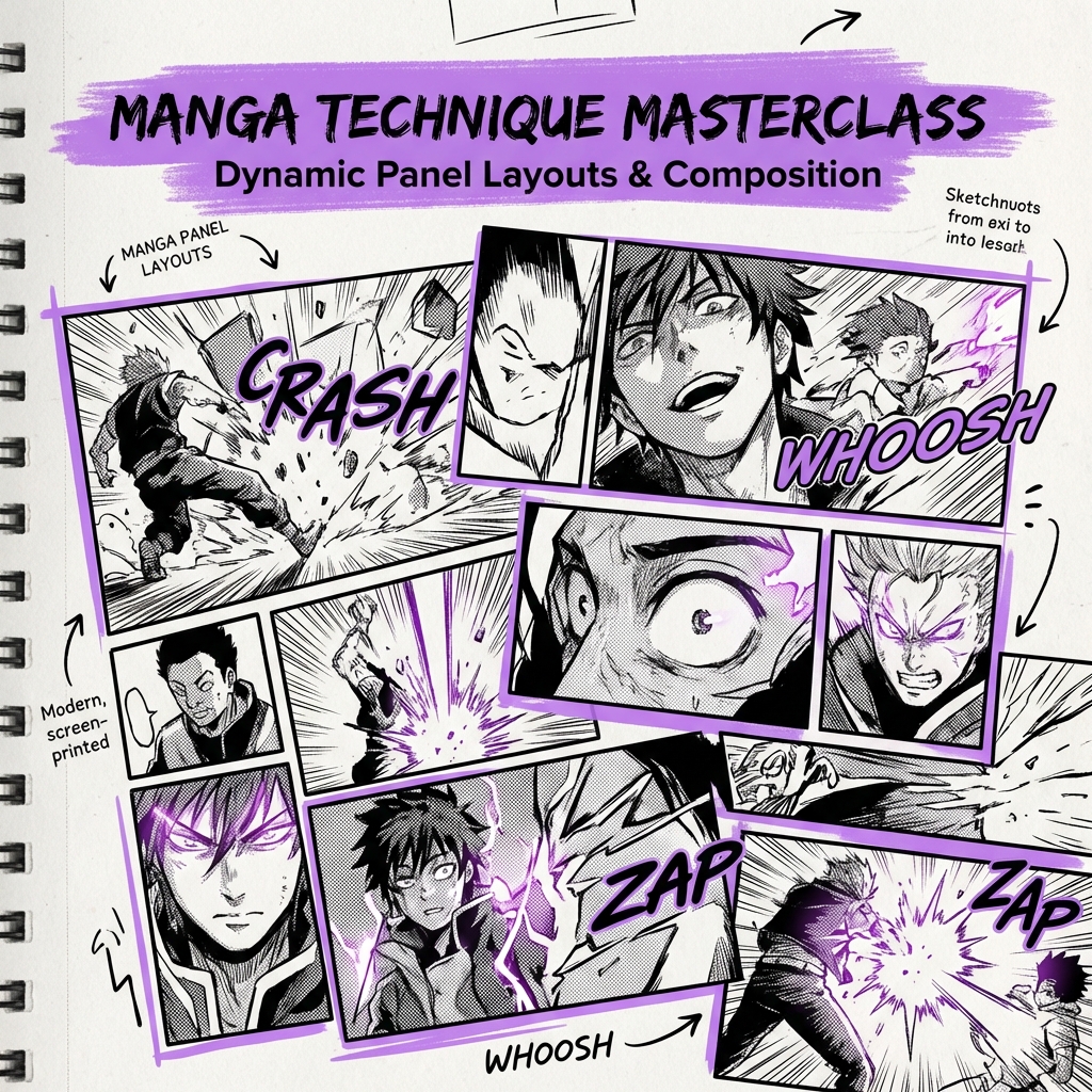
Panel layout is one of the most powerful tools in a manga artist's arsenal. The way you arrange your panels can make the difference between a confusing page and a masterpiece that flows naturally.
Understanding the Reading Flow
In manga, readers follow a specific pattern based on the publication's origin:
- Japanese manga: Right-to-left, top-to-bottom
- Western comics: Left-to-right, top-to-bottom
Always design your layouts with your target audience in mind.
Tip 1: Use the Rule of Thirds
Divide your page into a 3x3 grid. Place your most important elements along these lines or at their intersections for maximum visual impact.
Tip 2: Vary Panel Sizes for Emphasis
- Small panels: Quick actions, rapid dialogue
- Medium panels: Standard storytelling beats
- Large panels: Dramatic reveals, emotional moments
- Full-page spreads: Epic scenes, major plot points
Tip 3: Create Visual Rhythm
Alternate between different panel arrangements to keep your pages interesting. Too much uniformity becomes monotonous; too much variation becomes chaotic.
Tip 4: Use Gutters Strategically
The space between panels (gutters) affects pacing:
- Narrow gutters: Fast-paced action
- Wide gutters: Slower, contemplative moments
- No gutters: Seamless flow or overlapping action
Tip 5: Break the Grid When It Matters
Rules are meant to be broken—strategically. When a moment demands extra attention, let your artwork break through panel borders.
Practice these techniques and watch your manga pages come to life. Want to see your layouts transformed with professional coloring? Try Comic Fusion today!